Friday, July 29, 2005

Peggy Koenig


London Studies 1

Images from graduating students of the Masters Printmaking course at Camberwell
College of Arts.

Peggy Koenig is one of my printfreak friends who went to London to study Printmaking. Peggy is having the time of her life in London. She just graduated from Camberwell College of Arts in her MA in printmaking, and she is going to continue studying for an MA Fine Art Theory and Practice program at Middlesex University in London.

A recent find for Peggy has been a printmaker named Kim Westcott. Kim's work is very bold and textural. Peggy's been experimenting with a technique of hers where she sprinkles powdered pigment directly on to an inked plate prior to putting it through the press. Kim used a hydraulic press with 10k lbs pressure for this process, so Peggy was pleasantly surprised to get any kind of results from a simple etching press. The print above (London studies 1)uses this technique; Peggy said "although it doesn't show up to well on the image it does look quite nice in reality." There is a book available, titled 'Kim Westcott',and here's a website for Kim Westscott:
Kim Westcott

Thursday, July 28, 2005

Multiple Plate


Here is another experiment in multiple plate etching. I created three square plates, and printed them in different variations and color.

Viscosity experiments


This is one of my viscosity experiments from last year. I wanted to capture the texture and color of the rocks that bedazzled me while I was in Italy last year. The color is very intense and I'm not sure that I like it all that much. It would have been better to have more value. Since this was purely an open bite, I wasn't able to control the value. I do like the texture and the suprising areas where the color settled. As I said before, my new prints are based off of Irish ruins, so I hope to pull in the colors that remind me of Ireland, so lots of deep greens, splashes of crimson, deep yellows, blues. I guess in the past I have been influenced by the bright colors of gypsy (tinkers/travellers) caravans, the rustic colors from the Book of Kells. When I was about eight years old my dad bought a gigantic Book of Kells. It was as big as my body and very heavy. I used to spend hours and hours just looking through it on the weekends for many years. I used to get lost in the knots, and laughed at the strange men and animals that had large spooky eyes. The animals were twisted up in knots and some animals were biting other animals' necks. I think this is why I am so interested in strange imagery today and bright colors.

Prints


Lithography


undergraduate portfolio


Binocular antiquity
Monotype:Faust waterbased ink, Daniel Smith waterbased ink, chine colle, gold leaf.


Wednesday, July 27, 2005

Similtaneous vs. Multiple plate color?

This question was raised one day in our print shop by Joel. So far multiple plate color is by far better. This is one of the questions I'm exploring this summer.

Monday, July 25, 2005

Marcel Dzama


untitled, 2005
Hand-drawn lithograph
Edition of 15
Overall Dimensions: 9.125 x 9.125"

Marcel Dzama's work is always entertaining to me. I like the strange imagery, and funny characters. This print was done at Trillium press. It's always hard for me to know how much an artist has put into a print when he works with master printmakers. I kind of wish the artist would write a little something about his experience in the printshop.

Wednesday, July 20, 2005

Intaglio Simultaneous Color Printmaking


Krishna Reddy

I bought this book last year, and did a couple experiments out of it. This is the most fun process for me to do. Every time I pulled a print, I had no idea what was going to happen. Sometimes it looked awful, and other times I was amazed by the crispness of the colors. I usually work figuratively in a narrative manner, but sometimes just doing abstract work is the most fun.

So, I've decided to work with this book again. I have left over zinc plates from last year (I prefer to work in copper), that I'm going to cut up. I hate using the cutting bed at school because it is damaged and not straight. I usually end up with dents along my plates. I'm going to start going to the jewelry shop to cut my plates which is across the campus, but it's worth it.

Lately I have been looking a lot at old Irish ruins from 3300BC. I like this mythical Ireland site. Most of the sites are from the west of Ireland which is where I am from. These sites remind me a lot of my family members in Ireland. My family is extremely superstitious, and I swear half of them would not go to these sites in fear of being cursed. My Grandmother lives in the country side and somewhere around there there is a faerie circle. As a kid, I would always search the fields for it since nobody would tell me where it was. One time I ran into a bull, and I almost died right there of heart failure. I never did find it, and to this day nobody will tell me where it is. Apparently there was a neighbor who had a child that stumbled upon the circle, and she decided to move one of the stones. According to legend the mother, father, and child died. The extended family lost everything they owned, and nobody wanted to marry any of them.

So in this spirit, I shall make myself some new prints.

Interviews with Printmakers

Here is an excerpt from Jean Eagers Printmaking home page that I enjoyed reading.

Since studying printmaking at San Francisco State University, I began expressing social concerns, as well as making pretty pictures to sell and give as gifts.
Postgraduate study of Japanese rice-paste-and watercolor wood block printing methods, taught by Katherine McKay, and April Vollmer, increased my desire to teach multicultural printmaking. African printing on cloth and Latin American silkscreen printmaking are also topics which interest me.
However, multiculturalism in printmaking refers to much more than technique. It also refers to the issues that fine art may address, such as identity, ancient symbolism, representation, social and political conscience, language, narrative ethnic history, subject and style. Interviews with two San Francisco Bay Area printmakers highlight these issues.

An Interview With
Feminist Artist Kate Delos

Interview with
Asian-American printmaker, Alice Fong

Tuesday, July 19, 2005

79th Annual International Competition

From roberta fallon and libby rosof's artblog

Written by libby rosof
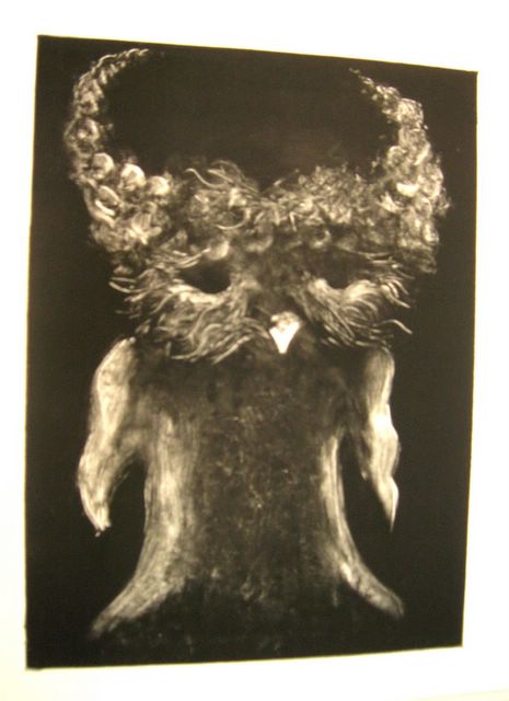
Old medium, new looks

Before this show blows right out of town, I wanted to get something up about the 
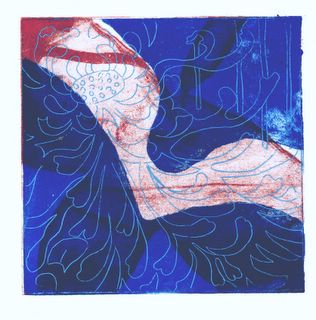
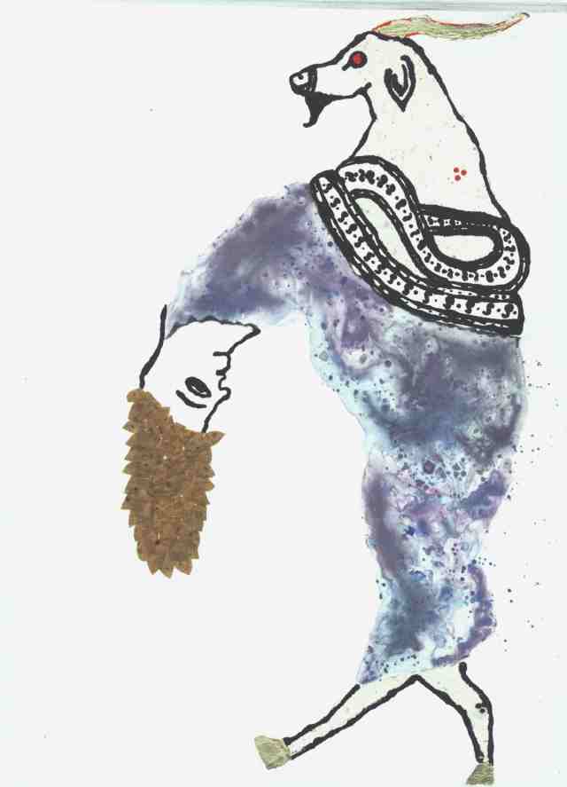
Print Center's "79th Annual International Competition: Printmaking." It's one of those shows that challenges any assumptions about prints as a weak medium, often falling prey to deadly process and control and old hat imagery. Well, at least I confess I sometimes feel this way about printmaking--but not after seeing this exhibit (below, Briana Clark's screenprint "Little Red Ridinghood," 10 1/2 x 11 inches).

Brianna Clark

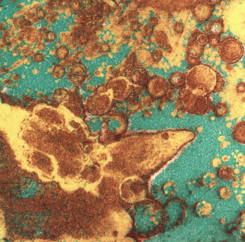
This show's a gem, with lots of provocative work from lots of artists I never heard of as well as some artists I have. Forty pieces by 35 different artists are included in the show, which was curated by Judith B. Hecker, the assistant curator in the Department of Prints and Illustrated Books at MoMA. Only one print in the show was entirely digital. The others relied mostly on traditional means of production (Below, Jacques Moiroud's etching "Sweet & Sour," 24 x 18 inches, New York, which won an award).

Jacques Moiroud

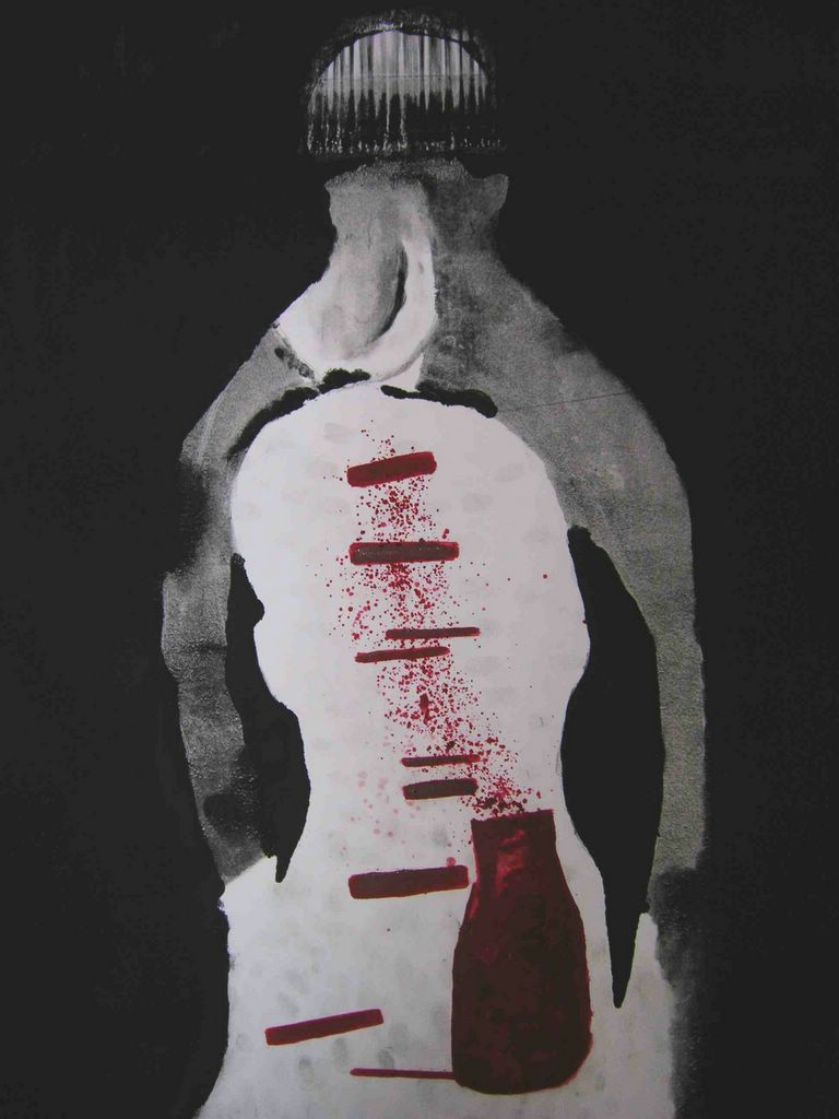
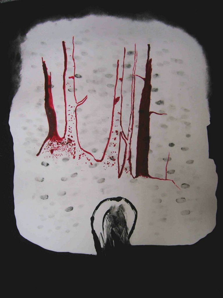
Familiar names in the show include three local artists--Kip Deeds and artblog favorite Jeanne Jaffe, both of whom won awards, as well as Althea Murphy-Price, who recently had a terrific piece in the Voxennial (see post here). Deeds' piece was purchased for the Print Center Permanent Collection at the Philadelphia Museum of Art, selected by John Ittmann, curator of prints there. The name of the award was the Anne Kane Museum Purchase Award for his screen print, "By Gone Attachements" (screenprint, 11 x 15 inches; Deeds is from Newtown, PA, and Roberta has written about him here).

Kip Deeds

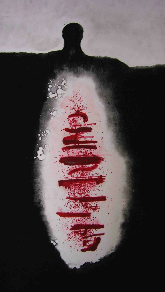
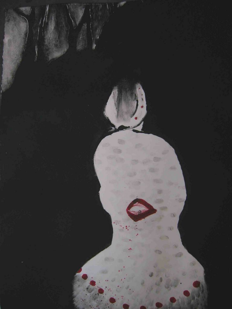
Although the means were traditional, the subject matter was right up to date, the imagery and styles chosen by artists with eyes wide open. There are wacky angles suggested by camera imagery and the movies; there's cartooning; there are metaphorical narrations and metaphorical abstractions and metaphorical portraits; there's a lot about how people relate to one another and about where people fit in the world at large. There are references to art history and the imagery of advertising that surrounds us daily (below, Murphy-Price's "Up Do Series No. 1" is a similar idea to her dramatic "Sunday Crown" sculpture, but the print's curly hair lines are delicate and gestural. Murphy-Price is an artist to watch).

Althea Murphy-Price

While some images seem to hark back to the 1940s, even those retain postmodern touches that make them look fresh (below, Daniel Brewer's woodcut "Empty Shirt," which captures a person cramped by the corporate life in the cartoony lines of the cramped clothing).

brewer, daniel

I cannot possibly begin to name each artist whose work I admired, because I liked nearly every one of the images. So I've put up a few images and just want to urge you to go to this show.

Also at the Print Center is a show of prints by Elizabeth Osborne. While I found this work less surprising, it has some fine moments, such as the view of a lake taken under different conditions. The contrast between the two is a reminder of what Osborne's work is about (top image, "Lake," and bottom, "Calm Water").

Elizabeth Osborne,
The other great moment, for me, was a view of Osborne's studio with a river beyond, the river becoming a metaphor for life passing by as the artist works, and also a metaphor for how art gives only a slice of what's out there (below, "River Studio")

Monday, July 18, 2005

Judy Pfaff


Judy Pfaff
OXO-XOX, 2005
Letterpress, wax
Edition of 30, 13 by 24 inches

Judy Pfaff's sculptures, drawings and prints have been exhibited in museums and galleries around the world. She has been described as a "collagist in space." Pfaff was named a MacArthur Fellow in 2004. Judy has been working at Tandem Press in Madison, Wisconsin since 1996 producing over 30 prints.

I also admire Judy Pfaff's prints. Her work explores the dichotomies of chaos an order, organic and man made, Eastern and Western. All of these are packaged producing unusual and complex images. One of my former printfreak-peers has been working with Judy at Tandem press this past year. I hope to make it to Madison next Spring to visit Tandem Press.

Wednesday, July 13, 2005

My visit to Nicks printshop in Barga, Italy


Myself and Swietlan Kraczyna a.k.a. Nick Posted by Picasa

My friend Nels took a class last summer on multiple plate color etching with Nick, which I have talked about previously. He invited me to go visit him. I was in Italy at the time doing the WWOOF program (which I highly recommend). It was my last week in Italy before heading up to Switzerland, so I thought I would swing by. The drive to the town was amazing. The roads were so skinny as we passed through forested mountains and valleys. There were tiny towns which had most beautiful atmosphere. Of course, at every little town there was the town elder sitting in a chair outside of his/her house watching the traffic and people going by. After a few hours of getting lost, we finally made it to Barga. The town seems to be split in two. On the top of the hill was the old Barga, and below around it was the newer Barga. Surrounding the whole town were green mountains as far as the eyes could see. Old barga is just beautiful. I got lost as I was looking for Nels, and I was astonished to see that there were so many art galleries and studios. It was a little town of what seemed like, artists. Because we were two hours late and the heat was unbearable we missed our meeting with Nels at the Cathedral. So, I was running around this quaint little maze of a town trying to track him down. Nels is not hard to miss. He's over 6 foot, skinny, and you never know what color hair he is going to have. Also, he usually wears purple all the time. I was so sad that we missed him. So, I waited for the tourist office to open (siesta time) and went to ask where I could find a printshop in the town, and also if I could check my e-mail. As I was using the e-mail, a loud American walked in and was asking for hiking trails. It was Nels!!! I was so happy to see him, and he to see me. He took me to Nicks printshop. It was amazing. Nicks prints were all over the walls in the front "gallery". I could have easily mistaken them for painting except for that intaglio look of how color and paper and texture come together just so beautifully. His craftmanship is just amazing and out of this world. I spend so long with my nose to his prints. It was a long time since I was in a printshop, and I immediatley went over to the ink and sniffed it. Yes, this was glorious. I missed printing so much. I met Nick, and he was such a nice person. I was a bit clumsy because I hadn't spoken English in almost four months, and the suddent shock of speaking English and being in a printshop just shut down all auditory senses. Around the walls were students' work. It was so beautiful. He has taught them how to use color so well. I was so jealous and wanted to stay forever. I'm sure I will go back and hopefully take his class after I have saved enough money. After being in the shop Nels, myself, my boyfriend, and some of the students went for some vino. We had a long chat staring over the valley surrounding by the warm hue's of the Italian rooftops and buildings. It was paradise. Who could ask more for a beautiful town, friends, and a printshop.

Tuesday, July 12, 2005

Printmakers visiting Printmakers


I enjoyed reading this article from the worldprintmakers website about Canadian printmaker, Audrey Feltham and her husband, Jim visiting Maureen Booth in Spain. There are brief diary excerpts from Audrey about her experience travelling to the remote town where worldprintmakers is located. Some of them are very funny. She also mentions a technique Maureen taught her of some prints that she had done using a collograph technique that employs a metal-based epoxy glue.
I didn't know anything about Maureen, but now I am fascinated with her life and what she is doing. It's so amazing that these kind of people exist in this world.

Wednesday, July 06, 2005

Swietlan Kraczyna (Nick)


The study of color etching workshop is held in Barga, Italy every summer and is taught by Swietlan Kraczyna (Nick). Last summer I was able to go visit him. The print shop itself is very small, but is set in the most romantic town in Italy. Nick teaches an intensive mutliple color class which lasts for about a month. Everyday the students do many color drills. There are three people in each group. Each person has etched their plate to ten different horizontal levels of etch. Each person then takes one of the primary colors, yellow, red, and blue, inks their plate and then it is printed wet on wet with each plate rotated during the printing process. This gives us 100 different colors. They also learned to use transparency which is mixed with the the ink to give varying levels of saturation. The then continue to do a subtractive print in this way, and finally a finished print using all the techniques they have used.
Nick calls his methods "working in color not with color."