Sunday, September 24, 2006

Enrique Martinez Celaya

Here is an artist that I really like. He came to Berkeley and worked with Paulson Press to produce some wonderful prints. I really like the mysterious dark imagery that he produces, but I also his use of symbolism and the way he manages to keep a consistent form of art making no matter what medium he might be using.

Some of his prints of Enrique Martinez Celaya at Paulson Press


His own wedsite : Enrique Martinez Celaya


Enrique Martinez Celaya

Enrique Martinez Celaya is not afraid of the dark. An artist who saturates his canvases in tar or washes of blood, the Cuban-born painter, 41, is engaged in a deeply visceral approach to art. The source of the blood he uses, human or otherwise, he won't disclose. Children, primarily boys, are the subject of most of his current work. But these are not studies in innocence. He gives young children credit for being complex, pensive beings. What could be more mysterious than the troubled brow of a silent 7-year-old? They are neither vulnerable nor frivolous nor mere sexual objects, really—though there is a sensuality to the diaphanous pajamas worn by Celaya's nephew in the sole photo in the show. And one might wonder why the boy paired with the girl (Boy and Girl) is missing a hand. What did he steal? What did he touch? Particularly striking is Boy in Icy Landscape, a Scream-like figure hunched in front of an iceberg, rendered on paper in blood, watercolor, and charcoal. The boy is curiously self-possessed despite his chilly solitude. Blood Landscape is not as dramatic as it sounds: A shirtless, androgynous child bows before a blossoming bough, a gesture of sad introversion, perhaps shame, beside a symbol of spring, life, and hope. The work is quiet and delicately painted in what could pass for a diluted burnt sienna with the absorptive quality of sumi ink. Tu Sonrisa, Miguel is half mirror; as positioned here in the gallery, it turns a neat trick of reflecting another painting from across the room. While Celaya's likely intention was simply to include the viewer's visage in the tableau, this effect is more interesting. This work is inspired by a famous poem by Spanish Civil War hero Miguel Hernandez, who while imprisoned lost his son to malnutrition. The son never lived to the age depicted in the painting, making the image a sad chimera. Poet and physicist Celaya is clearly a thinker, and his ruminations are deeply and physically imagined. "Splinter. Return." at Greg Kucera Gallery, 212 Third Ave. S., 206-624-0770, www.gregkucera.com. 10:30 a.m.-5:30 p.m. Tues.-Sat. Ends May 13.


Chagoya


Enrique Chagoya, Liberty, 2006 - Jacquard Tapestry, 72 x 74 in. Edition of 8


Enrique Chagoya playfully examines contemporary
cultural and internal borders in his first tapestry,
Liberty. The work is a unique original, translated from
a composite of collaged, painted, and drawn elements
assembled digitally by Chagoya and Magnolia Editions
co-director Donald Farnsworth. Chagoya’s trademark
wit and spontaneity are reflected in the result, which
projects both a formal strength and a light-hearted energy.
Liberty depicts a plush domestic interior, reduced to a
flat anonymity using stark red lines; its placid blankness
is interrupted by the presence of dinosaurs,
originally rendered in bold strokes of charcoal. In the
foreground, a tiny, “realistically” colored dinosaur
bearing the head of Jesus is menaced by an enormous
Tyrannosaur while resting upon the stenciled word
“LIBERTY.” Besides the impersonal and military
connotations of the stencil, its letters are reversed,
suggesting an inversion of the word’s meaning and
perhaps implying that it is being stenciled onto the
viewer. As Chagoya’s ghostly, carbon-black dinosaurs
chase the hybrid Jesus figure almost off the edge of
the tapestry, they touch upon both the looming spectre
of America’s dependence on fossil fuels and the
ideological masks donned by warring powers to justify
their violent actions.
About the Magnolia Tapestry Project
The Magnolia Tapestry Project emerged from artist
John Nava’s commission to decorate the vast interior
walls of the Cathedral of Our Lady of the Angels
in Los Angeles, which required a consideration of
the acoustical demands of the space: the decorative
element was to function practically by reducing
unwanted reverberation, prompting an inquiry into
the use of textiles. Nava and Farnsworth subsequently
collaborated on a series of woven experiments which
grew into an unorthodox approach to Jacquard
weaving. Using this approach, work by contemporary
artists is faithfully translated into a digital “weave
file” using custom calibrated color palettes developed
at Magnolia Editions. The completed weave file is
woven in Belgium on a double-headed Jacquard loom,
where 17,800 available warp threads generate colors
of unprecedented variety and density. As the tapestry
translation process evolves, various textural elements
can be reproduced with clarity – in this light, Liberty is
particularly notable for the legibility of even the most
subtle of Chagoya’s charcoal marks, which appear as if
applied directly to the woven surface.


© 2006 Magnolia Editions, Inc. All rights reserved. Text by Nick Stone.
In the same way that Tamarind and Gemini put the
commercial lithographic technology of the 19th century
into the hands of fine artists in the fifties and
sixties, the Magnolia Tapestry Project is putting the
electronic Jacquard loom to work in unexpected ways
for today’s artists. The Project includes tapestries
representative of several generations and numerous
art movements: the Pop princesses of Mel Ramos; the
monumental, Expressionistic figures of Leon Golub;
the hyper-realism of Alan Magee and Guy Diehl; the
playful poetics of Squeak Carnwath and William Wiley;
the post-Surrealist visions of Bruce Conner, and the
abstractions of Ed Moses and George Miyasaki are all
re-envisioned in striking new editions. The Magnolia
Tapestry Project has also produced tapestries by
Chuck Close, Lia Cook, Lewis deSoto, Donald and Era
Farnsworth, Rupert Garcia, Diane Andrews Hall, Gus
Heinze, Robert Kushner, John Nava, Nancy Spero,
Katherine Westerhout and others.

Friday, September 22, 2006

Opportunity

3/4 TIME OPPORTUNITY

Kala Art Institute (Berkeley, California)
Printmaking Studio Manager

Printmaking Studio:

Candidate must possess strong people skills, daily interaction with varying artists within a multicultural environment. Maintain and assure that all printmaking supplies and equipment are in good working order; research new equipment, research new supplies and new media for existing equipment. Order studio and class supplies, maintain inventories; prepare and ensure safe handling and code compliance of acids and other sensitive materials. Maintains records of studio supplies, chemicals, class supplies, storage, and equipment. Accomplish / oversee general cleaning and maintenance of all facilities (Printmaking Studio and Electronic Media Center); prepare studios and work areas for AIRs and classes.


Hours:
24-32 per week

Compensation:
$(13-16) per hour, D.O.E

Benefits:
Medical & dental insurance, paid vacation
Open until filled.

To apply:
No phone calls. Applicants are invited to submit a cover letter and resume and 3 references to:

Kala Art Institute
Attn: Michelle Grenier, Administrative Manager
1060 Heinz Avenue
Berkeley, CA 94710
Fax: 510.540.6914
E-mail: michelle@kala.org

Letterpress


I'm taking a bookmaking class this semester at the graduate level, and so far, I love it. This is a poem I wrote about a nightmare. This is just a first proof of the poem. I love letterpress. I love the process of putting the tiny letters into the holder and wrapping the string around the type to keep it in place. I love inking up the letters and printing onto the paper. I'm so excited everytime I go to class. Betsy davids showed us some handmade books and I think that I will have to take more classes on bookmaking in teh future. There is too much to learn in one semester.

The Masters


Odilon Redon
L'Ailé(The Winged)
lithograph in black ink on pale cream chine Appliqué with a white wove backing sheet, as issued
1893

David Tunick, Ink
works on paper

I found a great little website who specialize in old master and modern prints and drawings from 1450 to 1950. The collection includes works by Rembrandt, Dürer, Picasso, and Matisse, among many others.

Crown Point Press


Kathan Brown


The crown point presses new website features a virtual tour of the press, a webblog, video interviews with the artists, an interactive question and answer section, and ongoing ideas about thinking creatively. I really think you sould all check out the artist converstations. It helps me to listen to how other people talk about printmaking to realize my own thoughts.

Here is the list of artists printmaker talks:

Kiki Smith

Julie Mehretu

Tom Marioni

Mary Hielman

Fred Wilson

Robert Bechtle

Ed Ruscha


Kiki Smith


Still, 2006
Color spit bite aquatint with flat bite, soft ground
and hard ground etching on gampi paper chine colle
26 1/2" x 31", Edition 20

"Etching is something
you can spend your
lifetime learning about."

—Kiki Smith , 2006

Kiki Smith has been spending some time at Crown Point Press and seems to be working on a new series involving feet or legs. The above etching is quite provocative. There is something eerie about the flat skirt object and these very detailed realistic feet. The wash in the background is very dreamlike which works effectively with the black and white figure.

Wednesday, September 20, 2006


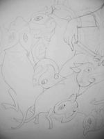
Here is a closeup. The girls are going to be playing with entrails of the creatures. Then I hope to draw a man shoveling the gutted creatures to a woman at a spinning wheel. Hopefully on top of all of that I hope to incorporate negative space celtic patterning. I'm having problems choosing what colors I want to use. I want to use color that are hot and popular with designers and the only color i can think of is hot pink, white, black, and yellow. It sounds disgusing, but the colors are bright and vibrant and actually work together really well. I'll see though.

I started to draw some irish girls from the 1950's onto my wall, and i paintied the heads of the celtic creatures

Wednesday, September 13, 2006

the3robbers

...untitled
...untitled,
originally uploaded by the3robbers.
I was randomly searching through flickr when I bumped into this printmakers work. I really like his work a lot. They remind me of prints that dawn was creating her last semester.


i photocopied pictures i liked...put photocopies image side down on to the paper i wished to transfer the images to...brushed paint thinner on the back of them...rubbed the back of the photocopies with a burnisher, but you could use the back of a spoon i guess...this transfers the image to your new paper...

solvent transfers are sooo dangerous. you should try doing a xerox transfer if you still have access to an etching press.

non-toxic steps:
1. fresh [day or less old] copies [photocopy toner works the best]
2. paint layer of shellac on back of paper to give it some substance.
3. get bowl, spounge, gum arabic.
4. dampen spounge.
5. rub gum arabic into copy paper to make areas that don't have toner resist ink [very much like litho process].
6. keep paper damp with spounge
7. use brayer to roll up copy. using spounge to keep copy wet and areas without toner resisting ink.
8. use an old etching plate for a backing plate. print onto either damp or dry paper.

Paper-Litho-Transfer

MATERIALS:

1. Shellac (Bull’s Eye Orange works best)
2. Xerox or Laser Print
3. Oil based Lithography Inks
4. Roller or Brayer
5. Newsprint
6. Gum Arabic
7. Sponges
8. One empty bowl
9. One bowl with clear water and a tsp. of gum arabic
10.

This process uses your Xerox or laser print as a printing plate. You usually get only one or two quality prints out of each Copy. It is a good idea to have MANY copies with you when you begin printing. Your Copy must be toner based (heat set) and not inkjet or any other water-based type.

Prepare your ink and roll out on slab. A small amount of setswell or varnish may be needed to loosen the ink. Keep the ink on the slab lean to help avoid scumming of your plate.

1. Shellac the back of the Xerox or Laser Print. This can be done ahead of time.
2. Spread a thin layer of gum arabic onto the glass slab to hold the copy in place.
3. Place the Copy face up on the slab.
4. Spread a thin layer of gum over the face of the copy.
5. With fresh water on sponge wipe excess gum from Copy.
6. Roll up the Copy with ink as if a lithographic stone or plate.
7. Wipe the Copy with the damp sponge.
8. Ink again.
9. Repeat until inked to your liking.
10. Place your good paper on clean plate and place inked Copy face down onto paper.
11. Cover with newsprint and then with blanket(s).
12. PRINT!

1st week over.


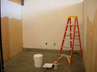
With the help of my wonderful boyfriend, I finally got my studio finished. Now it just looks empty and white. I signed up for a draw to win a $500 studio make over. I never win those things, but it sure could come in handy considering that I have not a penny to my name after my Greek adventures. It was worth it, but I need a job now.


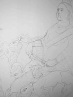
I started dawing on my wall. My plan this semester is to work large on the wall while I have smaller projects going on such as prints. As you can maybe see, I drew a huge drawing of Queen Victoria sitting on a pile of celtic-head-new-born-mice-bodies. Yes, I'm going crazy. No, actually I've been thinking a lot lately about appropriating old celtic forms to contemporary visual images, and through that working through recent issues and clashes between new and old Ireland. If you've been an active reader of my blog, you know that I have been working through this issue for some time now. When I close my eyes I see it happening. Because I have to write my thesis this semester, I am also getting a clearer sense of what I am drawn to and why which is making my art process easier and clearer. As an undergrad I spent a lot of time working on one powerful image but then it would die, and I work on something new altogether. I'm slowly learning that by taking one thing and beating it to death you can discover many more meanings and paths to take it. I often thought that people with no true talent approached art this way, but I'm wrong. It's not as much about talent as it is about exploration and truth.

This past week has been hard for me. Taking a year off was a great idea, but jumping back into it as a second year is tough. I really need to play catch up. I have to learn who everybody is again, and get a feel for this new class. This class is a lot younger than my class and they are more fun and outgoing. The new 1st class seem really really sweet. A lot of them are from the midwest, so that makes me very happy. We will invade and conquor. This past week, I've been having crazy nightmares again as I did when I was a 1st year, so I hope those go away. I've also been waking up panicked and I sweat a lot in class. I know I'm not the only one because other people in my class have been feeling the same way. I wish I was a 1st year again. It was tough but it was such a great year to explore and experiment. Adjusting to a new school was frustrating and heartbreaking, and nothing is ever going to be as nice as it was in the printshop of love, but I'm glad to be exposed to a new environment with new ideas and new processes. I've lived in three different countries, so I'm used to adjusting, but adjusting to graduate school was probably the hardest thing I ever went through. I think a lot has to do with taking that next step in your life where there is no first kiss or prom or first college party or any of those life rituals that you go through when you are young. Your not a college kid, not yet a mother or father, not even yet a professional, just a mid-20 yr old student stuck in no-mans land not knowing how to get where you want to go. But this is a great age really. It's time to get rid of those nasty habits, overcome certain anxieties, finally figure out what hair style best suits you. Knowing when to stop drinking, knowing what a jerky guy looks like and telling him to piss off. I guess it's about getting down to the real truth of oneself and growing inwards-out. Some people think they have it all figured out when they know nothing. I used to think I was the only one who new it all then I realized I didn't, and now I realize that neither does anybody else. Everybody is so insecure it's really amazing. So many people hide it so well. Then there are the "elders" who really help and care. I'm so fortunate to have many "elders" who care about me and understand. Sometimes I wish that the professors in my school would stop pushing me so much, but i know they do it because they genuinely care and they know it is tough after graduate school, and how much they are happy that they are not going to grad school these days. I have to stop writing now. I'm tired. But for all of you: "hang on-drink a pint-take a nap-hang on"


Close up of celtic-head-new-born-mice-bodies

Thursday, September 07, 2006

Day 3

My New Studio


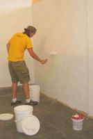
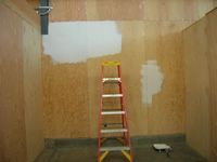
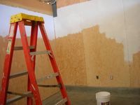
The new Hooper 2 graduate studios are now built, and I started to move in today. To my dismay they were not drywalled or painted for that is left up to us. You can imagine all the grumblings about this one. Anyways, I grabbed a bucket of paint and just started painting.


After the first coat, I realized that I would need at least two more layers of paint, and a spackle job. I'm not sure where everyone was, but I was the only one in there painting away. Maybe they didn't realize they could be in there, but i didn't care; I just went ahead and took over my space.


I had a lot of fun doing the spackle actually. After a spackle job and a second coat it actually looks pretty good. Tomorrow, I'll give the rest of the walls a second coat.
The Hooper 1 building got broken into last night and a bunch of expensive video equipment was stolen from some peoples studios. I don't understand why people steal from each other especially poor art students. Anyways, I'm going to have to be careful with my stuff because we don't have doors on our studio's (we're not allowed them) at least the building door is kept locked.

Wednesday, September 06, 2006

My Year Planned Out

Yesterday was my first day at school. I began by taking my Thesis seminar class with Ted Purves. This is going to be my schedule for the next year.

September: Begin writing experiment for thesis.

October:
Complete 1st section/chapter of thesis in draft form.

November:
Candidacy reviews during first part of month (errr!!!)
First draft thesis section due to thesis advisor. 12-15pgs.
December: Rough draft of Thesis due to thesis advisor.

Christmas Break: Copy of rough draft due to faculty advisor.

January: Review of rough draft with thesis advisor. Changes and additions made.

February: Submission Draft of thesis due.

March: Thesis due
Final reviews

Spring Break

Early April: Open Studios

Early May: Thesis Exhibition. All theses should be signed and recieved by Graduate office prior to graduation.

What a wake up call for either a year of hell or a year of growth....perhaps much of both. Creating art has to be put somewhere in here also.


Large Prints

Linden Langdon recently wrote a fun post about some printmaking students who printed a large print with lawn rollers at her school. Looks like it worked out great. I really like it when the class gets together to complete one project.

Linden Langdon Blog


Third year printmaking students from the University of Tasmania creating one big print using a lawn roller as a press.

Sunday, September 03, 2006

Lorg Printmakers


Lorg Printshop in Galway has just put up their new website.

Lorg Printmakers


Diamond point etching needles are amazing. I just bought this etching needle, and I am completely fascinated with how easy it is to draw onto metal. I've always avoided drypoint opting for etching, but I'm trying to get more health concious and drypoint is very safe. The tip of the needle is so tiny that I can barley see it, but that is good because I broke the tip off of my last needle.


Coming up events in the printworld of the Bay area:

SEPTEMBER 7, THURSDAY 2006
Residency Projects :2005-2006 Kala Fellowship Exhibition, Part II
Opening Reception:6-8 pm in the Kala Gallery

Exhibition Artists:
Miriam Dym, Gary Nakamoto, Sasha Petrenko, Tracey Snelling

Saturday, September 02, 2006


Happy Happy man Posted by Picasa

If you have never been to Berkeley at the beginning of a semester, you should know about the Happy Happy Happy man. He is an 80 yr old man who stands for at least eight hours on top of a bucket yelling slowly and with broken-english articulation "haaaaapy....haaaapy.....haaaaapy" I'm not quite sure what it means but it does get people's attention. He holds up cardboard with theories of doom written all over them. Last year was the disaster Katrina and somehow he came up with a theory about the coming of the end of the world because of it. Now he is on about Israel being terrorist #1. His theories don't seem to be biblically based, but he sure get's upset at the ignorance of Americans when it comes to important world issues.