Showing posts with label Printmakers. Show all posts

Monday, April 23, 2007

Julio Valdez


Julio Valdez's printed oeuvre attests to the significant role that printmaking can play in artist's career. Since1988, Valdez has made nearly 50 editioned prints, at least as many related proofs, and over 100 monotypes. His experimental mixture of techniques and openness to new processes continue to expand his creative program and the technical range of his work in all mediums.


Check out Julio Valdez website. It has a force of its own!


Essay: Surface and Symbol:Julio Valdez and the Printed Image

Wednesday, March 28, 2007

Katarina Vavrova


Katarina Vavrová is a very talented painter and graphic artist from Slovakia. Her work is highly poetical, imaginative, dreamlike and very suggestive. The quality of detail and draughtsmanship is extraordinarily well visible. The motives have their roots in literature and arts, historical events and persons. One can see traces from biblical events and from the time of the great discoveries, but also something from the outer world and something from the inner parts of the human soul. In her work the world of fantasy melds with reality, dream with actuality, and desire with experience.
Typical elements in her work are people, animals, men with wings, some hats or headgear and something in red colour. In many of her pictures we see a lady with a sad contemplating expression on her face.

The many prizes and awards received by Katarina Vavrová and the number of private an group exhibitions she has had, do prove that her art is of the highest quality.

Vavrová is born in 1964 in Bratislava, Slovakia, and today she lives and works in Pezinok which is nearby native town.

-more prints

Monday, March 05, 2007

Paul Wunderlich


While I was farming in Italy, I came across a book of an exhibition of artists who created kites. Paul Wunderlich was one of the artists, and I fell in love with his work after doing some more research on him. Some surprising information I found out was that Horst Janssen switched from lithography to etching as a pupil under Paul Wunderlich and later regarded Wunderlich as a rival. How surprising that these two are related. I can definitely see the resemblance, but some how I'm more drawn to Janssens work, but yet I like the surrealist aspects of Wunderlichs work. This is fantastic information to me! I need to find out more about this relationship.


Painter, sculptor and Printmaker

Wunderlich studied at the Hamburg Academy and after a three year stay in Paris returned to Hamburg to be Professor of the Art Academy there. He now lives and works in Hamburg and for part of the year in France.
His early work was in an "abstract-figurative" style, but in the sixties he adopted a more symbolist, even surrealist style. He painted and printed many images taken from the fine photographs by his wife, Karin Szekessy He has held many major exhibitions world wide and has won innumerable International prizes, particularly for his colour lithography. He has been immensely prolific and has a vast oeuvre of prints, paintings in many media, sculpture, jewellery and furniture design. His renditions after classic paintings by artists such as Dürer, Ingres and Rembrandt show his inventiveness


Red Fern Gallery-drypoints
The Hart Gallery-sculpture, lithographs, and painting.
Gallery Brockstedt-prints
Limited Editon Graphics-prints


-

Saturday, February 10, 2007

Audrey Niffenegger

You have to check this womans work out:
Audrey Niffenegger


The month of January was productive in that I got a lot of reading done. A way to escape my personal problems, I buried myself into "The Kite Runner", "The Memory Keepers Daughter", "The Curious Incident of the Dog in the Night-time", "Eighty Acres", "Middlesex", "Running with Scissors", "The Secret Life of Bees", "The God of Small Things", and "The Time Travellers Wife" by Audrey Niffenegger. I'm a complete sucker for time traveller books, and I loved this book. The main character is an artist who struggles through life using art as a medium to make sense of it. There are a lot of references to artists, museums, galleries, and also a lot of art school jargon which at times got on my nerves. Anyways, I was reading the biography on the back of the book about Audrey, and found out that she is a professor in the MFA program at Columbia College Chicago Center for Book and Paper Arts. After doing research on the school, I realized that what I love is bookmaking. I am completely fascinated in the process of composing a work of art using image and text. I love the process of making books, and I'm completely fascinated with different papers. I love the idea of creating etchings, woodblock prints, letterpress, lithographs, collage to create a body of work the ties together secretly. I love how intimate the experience of opening boxes and covers of books is. The feel of the material, the turning of pages, the build up of anticipation. The book doesn't have to be bound but turned page by page. The book can hang like a sculpture, hide like a private locked box, it can be coded and abscure, it can be mutilated misused. The process of thinking about making a series of prints with or without text in a book format has unlimited posibilities.

One bookmaker I admire is William Blake. This guy was completely possessed and it is said that his wife often helped him color his prints. I'll be looking more into this guy in the future. Aparently there is a book collection near LA which has a copy of one of his books, but you need special permission to see it.

Like a complete dork, I spent my birthday going to museums and galleries, and while I was in SFMOMA bookstore I noticed Audrey Niffenegger's graphic novel the
"The Three Incestuous Sisters". This book tells the story of three unusual sisters who live in a seaside house. Because of the artwork and mood, the book has been compared to the work of Edward Gorey (another favorite of mine). I started looking through the books and was completely amazed by her etchings.


So who I want to be when I grow up: a little bit of Audrey Niffenegger for her ability to write an awesome novel and create art; Kiki Smith for her ability to always be inspired and making things and have the coolest hair, Joel Elgin for his ability to inspire and create greatness, Betsy Davids for her calm wisdom, William Blake for being crazy, Kathy Neckar for her ability to keep her child-like curiosity, and love for life, Jon Stuarts humor, and Conan O'Brians ability to make me laugh out loud for being Irish.

Thursday, February 01, 2007

Woodblock Dreams

Final Print: Raping Darfur
I was browsing the the printblogs and wanted to point out to you, if you have not yet seen it, Annie's final woodblock print which is an extremely strong print that you have to check out. Also, she shows the process that it took for her to get to the final print.


Sunday, October 15, 2006

James Ensor


"Death Chasing a Flock of Mortals"
etching and drypoint
1896

James Ensor (1860-1949) Lifetime achivement of 133 etchings.

There was an interesting article in recent Art on Paper magazine about Tom Firmans 200 piece collection of Ensor prints. Tom first saw Ensors famous painting "Christ's entry into Brussels in 1889 and became thoroughly impressed by the artist. Later in New York he bought his first prints, by Gabor Peterdi who taught at Yale and was the author of "Great Prints of the World" Through Peterdi , Firman learned that prints provide an economical means to collect the work of as many of the worlds greatest artists. At first Firman was attracted to the fantasical qualities of Ensors etchings, but later began to appreciate Ensors keen sense of draftsmanship. His favorite print is a hand colored version of "Skeletons Trying to Warm Themselves". Ensor used this print to wrap the etching plate when it was not in use. Firman owns five etchings from Ensor's 1904 album "The Seven Deadly Sins". I remember that "Whipping Boy" did the seven deadly sins series as an undergrad.


Depraivity and corruption are timeless and for Ensor, humor provided the best means to face the dark side of human condition. It was this intensely pessimistic if ultimately realistic world view, expressed in a series of astonishing paintings and etchings, which made Ensor a pariah during his productive years as an artist, rejected not only by the right-thinking Flemish burghers of his native Belgium, but also by the members of Les Vingt, the avant garde group of painters of which he, himself, was founder and leading light.

Sunday, September 24, 2006

Chagoya


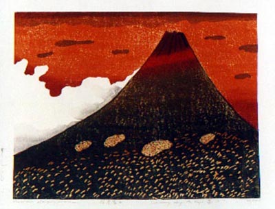
Enrique Chagoya, Liberty, 2006 - Jacquard Tapestry, 72 x 74 in. Edition of 8


Enrique Chagoya playfully examines contemporary
cultural and internal borders in his first tapestry,
Liberty. The work is a unique original, translated from
a composite of collaged, painted, and drawn elements
assembled digitally by Chagoya and Magnolia Editions
co-director Donald Farnsworth. Chagoya’s trademark
wit and spontaneity are reflected in the result, which
projects both a formal strength and a light-hearted energy.
Liberty depicts a plush domestic interior, reduced to a
flat anonymity using stark red lines; its placid blankness
is interrupted by the presence of dinosaurs,
originally rendered in bold strokes of charcoal. In the
foreground, a tiny, “realistically” colored dinosaur
bearing the head of Jesus is menaced by an enormous
Tyrannosaur while resting upon the stenciled word
“LIBERTY.” Besides the impersonal and military
connotations of the stencil, its letters are reversed,
suggesting an inversion of the word’s meaning and
perhaps implying that it is being stenciled onto the
viewer. As Chagoya’s ghostly, carbon-black dinosaurs
chase the hybrid Jesus figure almost off the edge of
the tapestry, they touch upon both the looming spectre
of America’s dependence on fossil fuels and the
ideological masks donned by warring powers to justify
their violent actions.
About the Magnolia Tapestry Project
The Magnolia Tapestry Project emerged from artist
John Nava’s commission to decorate the vast interior
walls of the Cathedral of Our Lady of the Angels
in Los Angeles, which required a consideration of
the acoustical demands of the space: the decorative
element was to function practically by reducing
unwanted reverberation, prompting an inquiry into
the use of textiles. Nava and Farnsworth subsequently
collaborated on a series of woven experiments which
grew into an unorthodox approach to Jacquard
weaving. Using this approach, work by contemporary
artists is faithfully translated into a digital “weave
file” using custom calibrated color palettes developed
at Magnolia Editions. The completed weave file is
woven in Belgium on a double-headed Jacquard loom,
where 17,800 available warp threads generate colors
of unprecedented variety and density. As the tapestry
translation process evolves, various textural elements
can be reproduced with clarity – in this light, Liberty is
particularly notable for the legibility of even the most
subtle of Chagoya’s charcoal marks, which appear as if
applied directly to the woven surface.


© 2006 Magnolia Editions, Inc. All rights reserved. Text by Nick Stone.
In the same way that Tamarind and Gemini put the
commercial lithographic technology of the 19th century
into the hands of fine artists in the fifties and
sixties, the Magnolia Tapestry Project is putting the
electronic Jacquard loom to work in unexpected ways
for today’s artists. The Project includes tapestries
representative of several generations and numerous
art movements: the Pop princesses of Mel Ramos; the
monumental, Expressionistic figures of Leon Golub;
the hyper-realism of Alan Magee and Guy Diehl; the
playful poetics of Squeak Carnwath and William Wiley;
the post-Surrealist visions of Bruce Conner, and the
abstractions of Ed Moses and George Miyasaki are all
re-envisioned in striking new editions. The Magnolia
Tapestry Project has also produced tapestries by
Chuck Close, Lia Cook, Lewis deSoto, Donald and Era
Farnsworth, Rupert Garcia, Diane Andrews Hall, Gus
Heinze, Robert Kushner, John Nava, Nancy Spero,
Katherine Westerhout and others.

Friday, September 22, 2006

The Masters


Odilon Redon
L'Ailé(The Winged)
lithograph in black ink on pale cream chine Appliqué with a white wove backing sheet, as issued
1893

David Tunick, Ink
works on paper

I found a great little website who specialize in old master and modern prints and drawings from 1450 to 1950. The collection includes works by Rembrandt, Dürer, Picasso, and Matisse, among many others.

Kiki Smith


Still, 2006
Color spit bite aquatint with flat bite, soft ground
and hard ground etching on gampi paper chine colle
26 1/2" x 31", Edition 20

"Etching is something
you can spend your
lifetime learning about."

—Kiki Smith , 2006

Kiki Smith has been spending some time at Crown Point Press and seems to be working on a new series involving feet or legs. The above etching is quite provocative. There is something eerie about the flat skirt object and these very detailed realistic feet. The wash in the background is very dreamlike which works effectively with the black and white figure.

Wednesday, September 13, 2006

the3robbers

...untitled
...untitled,
originally uploaded by the3robbers.
I was randomly searching through flickr when I bumped into this printmakers work. I really like his work a lot. They remind me of prints that dawn was creating her last semester.


i photocopied pictures i liked...put photocopies image side down on to the paper i wished to transfer the images to...brushed paint thinner on the back of them...rubbed the back of the photocopies with a burnisher, but you could use the back of a spoon i guess...this transfers the image to your new paper...

solvent transfers are sooo dangerous. you should try doing a xerox transfer if you still have access to an etching press.

non-toxic steps:
1. fresh [day or less old] copies [photocopy toner works the best]
2. paint layer of shellac on back of paper to give it some substance.
3. get bowl, spounge, gum arabic.
4. dampen spounge.
5. rub gum arabic into copy paper to make areas that don't have toner resist ink [very much like litho process].
6. keep paper damp with spounge
7. use brayer to roll up copy. using spounge to keep copy wet and areas without toner resisting ink.
8. use an old etching plate for a backing plate. print onto either damp or dry paper.

Paper-Litho-Transfer

MATERIALS:

1. Shellac (Bull’s Eye Orange works best)
2. Xerox or Laser Print
3. Oil based Lithography Inks
4. Roller or Brayer
5. Newsprint
6. Gum Arabic
7. Sponges
8. One empty bowl
9. One bowl with clear water and a tsp. of gum arabic
10.

This process uses your Xerox or laser print as a printing plate. You usually get only one or two quality prints out of each Copy. It is a good idea to have MANY copies with you when you begin printing. Your Copy must be toner based (heat set) and not inkjet or any other water-based type.

Prepare your ink and roll out on slab. A small amount of setswell or varnish may be needed to loosen the ink. Keep the ink on the slab lean to help avoid scumming of your plate.

1. Shellac the back of the Xerox or Laser Print. This can be done ahead of time.
2. Spread a thin layer of gum arabic onto the glass slab to hold the copy in place.
3. Place the Copy face up on the slab.
4. Spread a thin layer of gum over the face of the copy.
5. With fresh water on sponge wipe excess gum from Copy.
6. Roll up the Copy with ink as if a lithographic stone or plate.
7. Wipe the Copy with the damp sponge.
8. Ink again.
9. Repeat until inked to your liking.
10. Place your good paper on clean plate and place inked Copy face down onto paper.
11. Cover with newsprint and then with blanket(s).
12. PRINT!

Sunday, June 25, 2006

Jake and Dino's Chapman

Did anyone get to Madison for Jake and Dinos Chapman: Disasters of War?

This isn't what was on show at Madison, but if you read further down it says that the brothers bought Goya's disaster of war prints and reappropriated them. Personally, I think it is unacceptable to take Goya's prints and use them like a personal coloring book. It's disrespectful and childish to me. Some artists are just jerks and I fear the future of the art world when artists get off on using shock values inappropriately to cause a fifteen minute stir in the art world.

Jake and Dinos Chapman are influential British artists who, along with some of their contemporaries, came to the attention of American audiences when they appeared in the exhibition Sensation, which showed works from the Saatchi collection at the Brooklyn Museum in 1999 2000. The Chapman brothers disturbing contributions to that exhibition were sculptures of androgynous adolescents, whose in-your-face sexuality tested the mores of museum goers.


chapman Posted by Picasa


In 1999, Paragon Presspublished the Chapmans eighty-three print set, Disasters of War. The set refers to a series of prints by Goya which bear the same title, Desastre de la Guerra. The prints were not published until 35 years after his death, probably because they include satires on contemporary figures. Goyas series also records in considerable detail the atrocities and heroism of the Peninsular War between Spain and France waged 1808 1814. Though it contains the same number of prints, some of which refer directly to Goyas series, the prints in the Chapman brothers series do not attempt to recapitulate Goyas series and instead treat Goyas prints without reverence or restraint. [A portion of this set will be on display at the Chazen.]
Some more examples of their portfolio are atParagon Press


chapman Posted by Picasa


In 2003, the brothers sold another complex war diorama (of wartime atrocities laid out on a swastika-shaped pedestal) and used part of the proceeds from the sale to purchase their own set of Goyas Disasters of War series. They then painted deranged clown and puppy faces over all of the visible faces of Goyas figures. The result, which they entitled Insult to Injury, caused a scandal among critics offended by what the Chapman brothers called their rectifying of the prints. Jake Chapman defined their sense of the meaning of rectified as being the same as when the word was used in the movie, The Shining, when the butlers trying to encourage Jack Nicholson to kill his family, to rectify the situation.---more from the Guardian

Monday, June 19, 2006

Francesco Clemente


francesco clemente Posted by Picasa

Francesco Clemente:
Crown Point Press
Pace Prints

Article in Circa


Categories: Allegory, Neo-expressionism, Transavantegarde.

Italian-born artist, Francesco Clemente, is part of a group of Italian artists that returned to a figurative style of painting in the 1970s. Clemente draws from a multitude of sources, from Roman and Indian civilizations to astrology. Clemente's paintings and prints are highly personal and subjective; he often creates his images from memory


clemente Posted by Picasa

Sunday, June 11, 2006


The British cartoonist Martin Rowson updates the Hogarth jab in "Cocaine Lane" (2001). Posted by Picasa

Thursday, May 18, 2006

David Lynch


During my first semester at CCA some of my viscosity work was compared to some prints David Lynch made. What an honor..I thought. I primarily know him as a great film maker, and I knew that he had done some art, but I didn't realize at that point that he had done some printmaking. It was a great suprise to me. There's a great little story that Prof. J tells us about a student who tried to chine cole an actual mouse onto paper (don't worry folks...I'm pretty sure it's a LIE), but rumor has it that David Lynch actually did that. I'm afraid my naive little self does not believe this rumor, but if anyone can clarify things better for me that would be great.

He worked for a while at Madison's Tandem Press:
Lynch describes his painting as a process of action and reaction. During his three visits David Lynch created 118 different images-monotypes along with editioned prints and photogravures. The works are mostly monochromatic. They have a deliberately primitive and crude quality, which results in works of great beauty. He includes words in many of the images, which are intended to start the viewer thinking about the works, but he also sees the words as forms, shapes, and textures.

In a talk that he gave in 1997, David Lynch described how he felt about the process of printmaking: "It has the same sort of excitement as when you go to the photo shop to get your pictures back. Even though you took them, they never come out exactly the way you see them through the camera. There is always some sort of surprise, and that's the way it is with printmaking. With action and reaction exciting things begin to happen."

DAVID LYNCH

Thursday, April 13, 2006

Paula Rego


Born in Portugal, Paula Rego's work always has a sense of magical realism; quirky contemporary mythologies pointing to an underlying psychology and sexuality, through a feminine view point. The Fitting is a scene of fairytale romance turned nightmare. Reminiscent of Velasquez' Las Meninas, Paula Rego uses loaded imagery and symbolism to create a surreal mystery for the unravelling.

Sunday, April 09, 2006

Jude Griebel


In Jude Griebel’s paintings and prints, elements of storybook narrative and adult experience are combined to create scenes that have a foothold in both the real and imaginary. Regarding his work, Griebel states: “I am interested in how youths are able to project their imaginations onto domestic and everyday spaces, transforming and doubting the familiar. It is this state of questioning, anxiety and nostalgic wonder that I attempt to translate through my painting.” The costume has become a repetitive theme in his work as a tool of transformation, disappearance and disconnection from reality.

Paintings

Monday, March 20, 2006

Hideo Hagiwara


This is one of the prints out of 36 that I am framing right now for an upcoming exhibit at the Institute of East Asian Studies. I love framing these prints they are just breathtaking. I have so much respect for Hideo Hagiwara.

Mount Fuji is renowned worldwide as Japan's highest and most perfectly shaped mountain. Revered since ancient times by followers of both the Shinto and Buddhist faiths and serving as a metaphor in classical poetry, Mount Fuji has taken on many roles in pre-modern Japan. In more recent times artists have projected a wide range of personal interpretations onto what was once regarded as an eternal, unchanging symbol.

This exhibit highlights prints from Hideo Hagiwara's 'Thirty-six Fujis' (Sanju-roku Fuji) series. Hagiwara, who has a house near Mount Fuji, and thus was able to observe the mountain during different seasons and times of the day, produced the series between 1977 and 1986, continuing a long tradition of representations of this famous mountain.

Hideo Hagiwara is one of the most distinguished woodblock print artists in Japan today. During the course of his long career he has exhibited all over the world and has won numerous prizes. His prints are held by major museums in Japan, the US and Europe, including the Museum of Modern Art, New York; the Art Institute, Chicago; the Victoria and Albert Museum, London; and the Vienna National Museum of Art.

A selection of Hideo Hagiwara's Japanaese woodblock prints will accompany the Yukimi Kambe Viol Consort's presentation of New Sounds from Old Instruments on March 31, 2006. The accompanying slide show will cover a variety of different modern Japanese artists including Hideo Hagiwara.

Sunday, November 20, 2005

Kiki Smith and Chuck Close


Yesturday I went to the SFMOMA and saw Chuck Close and Kiki Smith. They were at the museum to sign their books. I was so excited that day. The book I ordered online "Prints, Books, and Things" did not come this past week, so I bought a different book that goes along with her exhibit at SFMOMA. The line was about two hours(?) long, but I waited only half an hour because a woman came through the line asking for people who only needed Kiki Smith to sign the book. Most people were there for Chuck Close and it made me think a bit about the commercialization of art. His art was on posters everywhere all over San Francisco. I enjoy Chuck Close, but I can relate more to Kiki Smith. Anyway's the woman took me passed everyone and straight up to Kiki Smith. All of a sudden I felt like I had stage fright and time slowed down considerably. After she signed my book I sat down in a chair in front of both of them, and took a load of pictures. It was exciting, am I a nerd or what? After sitting there for a while staring at them, I left and went to the exhibit. I've never seen Kiki's work in real life, and was amazed at her work. The space was just perfect and I walked smoothly through the exhibit taking time to look really close at her prints. Most of her work was sculptural which is what she became famous for. I must say her work is much better in real life than in a book. I was drawn to the loose way in which her paper works were displayed. A lot of her work is printed on handmade japanese paper and just hangs off the wall. So soft and delicate, but her work was layered with heavy content. I enjoyed the sculptural bits which were on the floor infront of the prints. It was just so great to be there.
This was a Chuck Close piece that I enjoyed looking at. It shows his process of printing a nine plate color etching. The top row goes from pink to brown. The bottom row is each color plate printed in succession. Each plate was just a bunch of scribbles which in the end turned out to be a color portrait of Chuck Close. It was fascinating to me. I did get tired of Chuck Closes work by the end and went back to Kiki Smith's work to see anything that I might have missed. After looking at thier work, I went through the rest of the museum and was happy to come across Frida Kahlo's work. There is not very much of her work in Europe. Also, I saw a Chris Ofili painting which was exciting. I tried to smell the elephant dung, but it didn't smell at all. I left the museum feeling exciting and full of ideas.

Sunday, November 06, 2005

Art on Paper Nov/Dec 2005


Wilson Shieh,
Baby,
color direct gravure with aquatint, spitbite, aquatint, and Ganmpi paper chine collé

I'm about to run out of the door and pick up this month's "Art on Paper". It's their second annual print edition.

The Year in Prints, Second Annual
prints by:
Mary Lee Bendolph / Enrique Chagoya / Shoshana Dentz / Tony Fitzpatrick / Ellen Gallagher / Trenton Doyle Hancock / Carrie Moyer / Shaun O’Dell / David Row / Ed Ruscha / James Siena / Wilson Shieh / Dana Schutz / Carolyn Swiszcz / Richard Tuttle / Kara Walker / Andrea Zittel

Thirty-five years ago, it would have been unlikely to walk into a collector’s home and find limited edition prints hanging in the company of paintings. Prints were considered the affordable offspring of contemporary art; people acquired them because they did not have the money to buy unique artworks by their favorite artists. Today things are changing and collectors acquire contemporary art with less regard to a particular medium. Still, we think it is instructive to single out prints as a sub-genre of contemporary art because the world to which they belong is full of fascinating contradictions. Technically, prints can be both inventive and arcane, incorporating the latest digital discoveries while making great use of such primitive processes as woodblock carving. Socially, they are simultaneously elitist and populist. Originally developed to ensure the widespread proliferation of images and ideas, fine art prints are now generally published in small editions of between ten to thirty impressions. For our Second Annual New Prints Review, we looked at more than 175 submissions from 81 publishers and workshops. The prints we considered were all published in the United States between September 2004 and September 2005 and adhere to the traditional definition of printmaking: they were printed through the transfer of an image from a matrix or plate to paper (i.e., lithographs, silkscreen prints, etchings, etc.). We selected seventeen for inclusion here, which is less than ten percent of what we reviewed. With regard to publishers and workshops, there are many whose prints were included last year that do not have prints included this year; several whose work is appearing for the first time; and a few that are represented by two prints, in part, because we are particularly excited about the artists they are working with right now. Although there is a lot of deserving work that is not here, we believe that the pages that follow provide a representative overview of some of the highlights of the year. —The Editors

Wednesday, October 12, 2005

Otto Dix


Over a year ago, I was working on a farm in the mountains of Northern Italy, and the woman we were working for told me about a little art museum in the near by town in Revereto. It took us an hour to hike down the mountain and another hours drive to get to this town. We had been living for weeks without outside contact...hot water, heat, and electricity, so this was quite an adventure for us to be in society again. Of course I gourged myslef on 30cent chocolate bars from Lidl, 50cent wine cartons, 1Euro Brie, and 3Euro for the best gelato in the world. We headed for the art museum. I wasn't expecting much, and was happy to have gotten in under a student discount. (I look very young, so it was very easy to get discounts for under 18yrs of age in Europe....I even got into the Louvre for free!!!). The exhibition was on the Dolomites, so we spent room after room, hours, after hours....gazing at oil paintings of mountains. I thought I was going to die. I have very little appreciation for so many paintings of mountains. Finally we came across a print. It was a print made by Albrecht Durer, and aparently he had travelled on foot (possibly he had a horse) across the dolomites. It was his first time going to Italy for he was trying to get to Venice. Seeing his print made me so happy. I thought about him hiking through the mountains that I was staying in, and I thought how brave he was, and how scared he must have been. We were also both the same age at that time. As we continued, we saw more paintings of mountains, and I finally had enough, so we ran through the rest quickly. Suddenly, I saw very dark images on paper. I got closer and realized that I was seeing something amazing. I thought to myself "...no this cannot be Goya because it is too messy, but it looks so similar." I saw the artists name and it was Otto Dix. I thought to myself what an amazing discovery I have found in the middle of no mans land. I wrote his name down and had a huge grin on my face all day. After my trip was over I was able to do more research on him. Somehow in the back of my mind, I had already known about him, but only through his paintings. I find his etchings a whole lot more compelling.